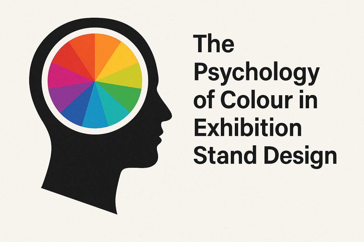
The Psychology of Colour in Exhibition Stand Design
When it comes to standing out at a busy trade show or event, colour isn’t just decoration — it’s strategy.
The shades you choose for your exhibition stand walls can influence how visitors feel, think, and even behave.
Understanding the psychology of colour in exhibition stand design can help you attract attention, build emotional connections, and leave a lasting impression — all before you’ve even said a word.
Let’s explore how colour affects perception and how to use it effectively in your exhibition stand walls and displays.
Why Colour Matters in Exhibition Design
At an exhibition, your stand is your brand’s physical environment. Visitors make snap judgements based on visuals — often within just three seconds.
Colour is one of the first things they notice. It communicates emotion, defines brand identity, and guides visitor flow.
In short, your exhibition stand walls are more than structural — they’re psychological. The right colour palette can make your stand feel:
Welcoming or exclusive
Calm or energetic
Sophisticated or creative
That’s why professional exhibitors consider colour psychology as carefully as layout or lighting.
The Emotions Behind Key Colours
Here’s a breakdown of how common colours influence behaviour — and how they can be used in exhibition stand design:
1. Blue – Trust, Calm, and Professionalism
Blue creates a sense of reliability and calm. It’s ideal for brands in technology, finance, and healthcare.
Use blue tones on exhibition stand walls to create a professional and trustworthy atmosphere, especially when paired with clean white lighting.
2. Red – Energy, Urgency, and Passion
Red is powerful and attention-grabbing — great for drawing people in from afar.
However, use it sparingly; too much can feel overwhelming. Combine red accent panels or graphics with neutral modular exhibition walls to balance intensity and focus energy where you want it most.
3. Green – Growth, Balance, and Sustainability
Green represents nature, health, and innovation — perfect for eco-friendly brands or those promoting wellbeing.
When paired with eco-friendly exhibition wall systems or sustainable materials, it reinforces a commitment to environmental values.
4. Yellow – Optimism and Creativity
Yellow radiates warmth and positivity. It can make smaller stands feel brighter and more open.
Accent lighting or bold wall graphics in yellow can energise visitors and draw attention to key messaging areas on your display walls.
5. Black and Grey – Luxury and Sophistication
For high-end brands, dark tones exude elegance and confidence.
Black exhibition stand walls can create a premium backdrop that highlights products or lighting features beautifully — particularly when contrasted with metallic or illuminated details.
6. White – Simplicity and Space
White walls make stands appear larger, cleaner, and more minimalist — ideal for modern and art-inspired displays.
They’re also versatile: you can overlay brand colours, lighting, or digital projections easily for a polished, gallery-like look.
Colour Combinations That Work
The most successful exhibition stand designs use colour combinations strategically.
Some tried-and-tested pairings include:
Blue + White: Corporate, clean, and trustworthy.
Black + Gold: Luxury and premium branding.
Green + Natural Wood: Eco-friendly and organic.
Red + Grey: Bold yet balanced.
White + Accent Colour: Simple but highly customisable for modular walls.
When planning your exhibition stand walls, always ensure your palette complements your logo and marketing materials for consistency across every touchpoint.
Lighting and Colour Psychology
Lighting can completely change how colours appear — and therefore how your stand feels.
For example:
Warm lighting enhances reds, oranges, and yellows, creating comfort and intimacy.
Cool lighting sharpens blues and whites for a crisp, modern look.
LED backlighting behind coloured wall panels can add depth and sophistication.
If you use modular exhibition walls, integrated LED lighting systems can help you adjust tones throughout the day or highlight specific product zones.
Using Colour to Direct Visitor Flow
Colour doesn’t just set the mood — it also helps guide movement.
Subtle changes in wall colour or flooring can lead visitors naturally from one zone to another.
For example:
Use darker colours on perimeter walls to frame your space.
Use lighter colours inside to create an inviting feel.
Apply accent colour lighting on feature walls to draw attention to key products or demos.
With modular wall systems, you can easily adjust configurations and colour placements for different venues and audience types.
Brand Consistency Is Key
Whatever palette you choose, it must align with your brand identity.
Visitors should instantly recognise your company through your exhibition stand walls, graphics, and colour schemes.
Consistent use of brand colours across exhibitions helps build familiarity and trust — especially for returning visitors or repeat clients.
Conclusion: Design With Psychology in Mind
The colours you choose for your exhibition stand walls do far more than look good — they shape how people think, feel, and engage with your brand.
By understanding colour psychology and pairing it with modular design, smart lighting, and creative layouts, you can create an exhibition stand that captivates attention and converts curiosity into connection.
Need Help Designing a Stand That Stands Out?
We specialise in modular exhibition stand walls, wall lighting, and full installation services across the UK.
Whether you’re looking for a clean minimalist look or a bold, branded space, we’ll help you design a stand that combines strategic colour psychology with professional structure.
👉 Contact us today to discuss your next exhibition project and discover how we can help your brand make a lasting impression.